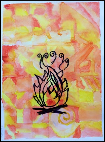
This was my first art project this year, and first watercolor of the 3 part series I ended up doing! I had been thinking about doing a fire painting at the end of last year, but going into the project I didn't know what the end result would be. I definitely think this is a Harris- styled piece, because when I create art, I interpret color and line design as two completely different art elements. I didn't copy any designs for the fire, and the background design of the watercolor is original as well. I reflected on my work after I did the watercolor background, and noticed a basic gradient of more specific designs to less specific designs. I changed a few squares in the middle so there would be a solid gradient of specificity. This is an example of reflection. I also communicated through my work by expressing how hot fire is as an element. My design is placed very specifically here so that the red spot on the background can be seen and communicated as the center of the fire. I think everyone has fire within them, and I definitely expressed my internal artistic fire here.
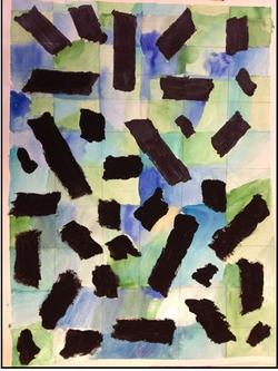
This was the second piece in my watercolor series, and I think this one is very different from my other two, and while it is art, I don't think it is as powerful as the other two pieces. I decided to create a very original piece, yet different from my first work. In the art piece, I put tape pieces down before I did the watercolor, which was definitely a risk I took in the artwork. I deferred from the main project, and took a risk with the second piece in this series. Whether it worked out or not, you, the viewer of the artwork, gets to decide. I also solved problems in this one. After I finished the watercolor background and removed the tape, I was left with a lot of white space, which didn't fit with the painting. I decided to color the spaces black, first with sharpie then with paint. I like the look of the black, and it gives off a sort of shadows feel to the abstract painting.
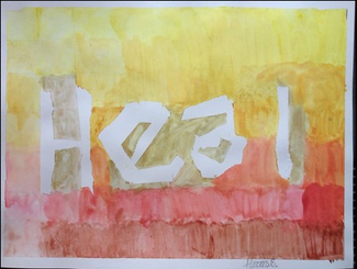
This was the final piece in my September watercolor series. I actually finished this project at home after week 2 because we were starting something new the following week. Overall, this is my favorite painting of the series, and definitely outshines the others. I sent a clear message through my artwork with communication. The message I sent was that artwork is a great well to heal yourself. Whether you are just loking at artwork, or just finished a piece, artwork is chicken soup for the creative soul. Along with self-expression, I used a variety of art techniques that I haven't used recently. I developed my color gradient skills by first going from yellow to scarlet vertically and using the color wheel as my gradient, and then using a light to dark gradient from left to right. The left to right gradient could have more precise if I had taken more time for the piece, but both gradients definitely give a sense of dimension to the artwork. I also used technology as a tool in this one. I used my phone camera to see which direction the piece looked best in, and then posted the picture to instagram. I also used the camera to get a rough sense of what other viewers would be seeing in the piece (instead of through my eyes).
Overall this whole project was fun and expressive, and I would love to pursue watercolors again later in the year.
Overall this whole project was fun and expressive, and I would love to pursue watercolors again later in the year.
 RSS Feed