This project may be favorite project of the term. We started out making two canvases using gesso, and then we started our project. I knew I wanted to make my two paintings different, but I did not know how different they would look when I was finally done with the project.

This is my first one. I made it into a rain design. We started with the background, and I chose gray, which was a neutral color. Then, when I got the painting back, it looked darker then I had imagined, but I compromised and chose a rainy day as a scene to express abstractly. I did some blue splatters to express the rain, and when it was time to create the dots, I took a risk and made clusters of dots to make clouds. I turned out alright, and I made smaller paths of dots to represent more rain. Overall, this piece is great, and definitely communicates a rainy day well.
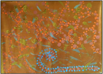
This project I went for a metallic vibe. It was Christmas time, and I wanted to represent Christmas as a commercial thing. I don't know if the piece actively reflects that, but it is one of the subtexts I was sending with this piece. The cinnamon color went on nicely, and I like the pattern of the dots, and how they mix with the orange and light blue to create the web on the top and the sled on the bottom. I collaborated with my classmates to decide the orange color for the web, and I am really glad it turned out well.
 RSS Feed